Our mission
Rhythm Church exists to lead people to become completely devoted followers of Christ.
Last Updated: 17 Sept 2026
Rhythm Churches brand guideline refers to the set of standards that we use to present and maintain a consistent brand in both public and private channels. Having this document ensures that our church is able to maximize its impact on people in terms of brand recall.
Rhythm Church exists to lead people to become completely devoted followers of Christ.
We exist to help people discover God’s rhythm for their lives.
This section defines how the logo should be used and what versions exist. It includes the primary logo (full lockup), and secondary variations (stacked, horizontal, icon-only), along with clear space and minimum size rules.

The shape: The rounded square presents a balance between elegance and playfulness, creating a visually welcoming icon for all people. This helps others have a positive first reaction to the name of our church and our brand.
The symbol: You may not notice it at first glance, but the RC is intentionally positioned slightly left of center within the rounded square. Much like the heart sits securely within the body, the placement is designed to feel natural, balanced, and protected. The hard vertical line of the R creates visual weight on the left, while shifting the symbol slightly prevents the C from feeling crowded against the right edge. This subtle adjustment creates a sense of symmetry, comfort, trust, and safety at the heart of our brand.
The style: The shape, the symbol, and the typography come together as one unified brand. Together, they create a playful yet professional aesthetic that feels welcoming, and intentional. The result is a beautiful visual identity that balances minimalist professionalism with just enough curiosity to feel distinctive and memorable.

The use case: Use the secondary RC logo when flexibility, middle alignment, or space is needed.

The use case: Use the RC icon when the design requires maximum simplicity, recognizability, or small-scale clarity.
This section will outline our core brand color palette. It includes hex, RGB, and CMYK codes for both digital and print consistency.
This is a list of Rhythm Churches primary colors with HEX, RGB, and CMYK values.
#49687D
73 / 104 / 125
42 / 17 / 0 / 51
#ffffff
255 / 255 / 255
0 / 0 / 0 / 0
Our secondary colors support the primary palette through backgrounds, typography, UI elements, and subtle accents. They should complement Rhythm Blue and White rather than compete with them.
#2C3135
44 / 49 / 53
17 / 8 / 0 / 79
#E8ECEF
232 / 236 / 239
3 / 1 / 0 / 6
#8FA29B
143 / 162 / 155
12 / 0 / 4 / 36
Use these approved combinations to preserve legibility and accessibility contrast.
Below is Rhythm Churches typographic system defined. It includes notes on sizing, weights, styles, spacing, and where/how to use each.
At Rhythm, every detail matters, including typography. We use Montserrat for its clarity, frindliness, and versatility, with Black, Bold, Regular, and Light creating a simple, consistent system. We favor sentence case, capitalizing only the first letter for a more natural and approachable feel. Our signature -41 letter spacing brings the type closer together, transforming a familiar font into something distinctly on brand with Rhythm.
Montserrat Black
Montserrat Regular
Below is a clearly defined type hierarchy with examples.
This section outlines how our brand sounds in writing — and how that reflects its personality.
Below describes the brand’s tone and communication style in 3 personality traits.
We communicate with simplicity, purpose, and zero fluff. Every word matters.
“Here’s what this means and why it matters for your life today.”
We speak with confidence and conviction. Our tone calls people higher and challenges them deeper, unapologetically pointing people toward Jesus.
“Don't settle for less when God has called you for more!”
We uplift, build, and inspire. Our voice breathes hope, faith, and possibility into every environment.
“You’re not alone. God is working in your life, even when you don’t see it.”
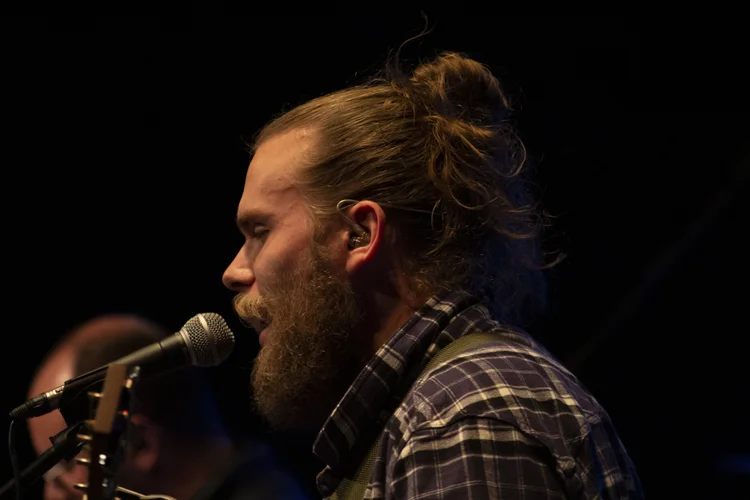
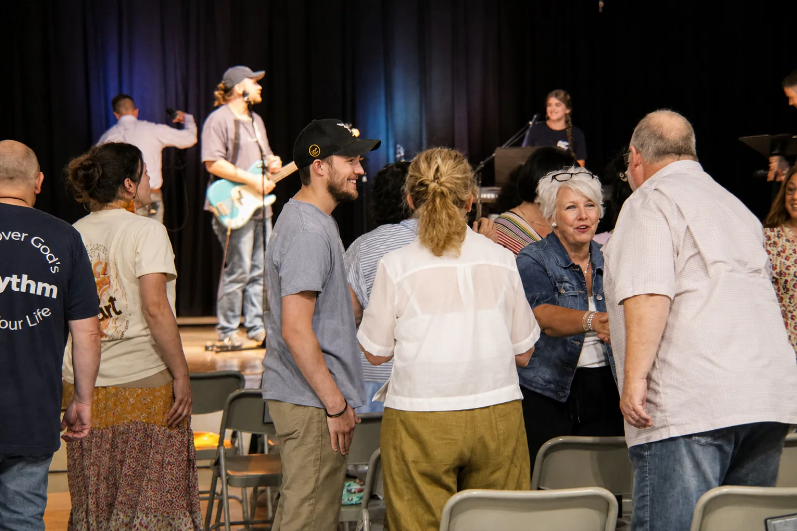
At Rhythm, we are dedicated to capturing stories, not just pictures. We focus on smiling faces, lifted hands and powerful preaching. We then weave these moments into our online story.

We love smiling faces!
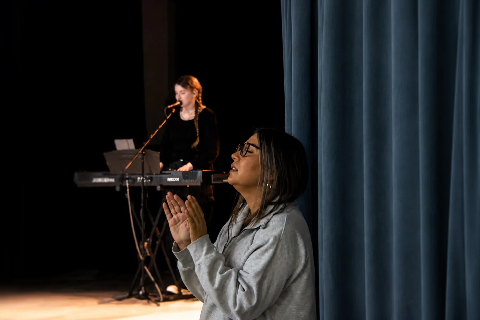
We love lifted hands!
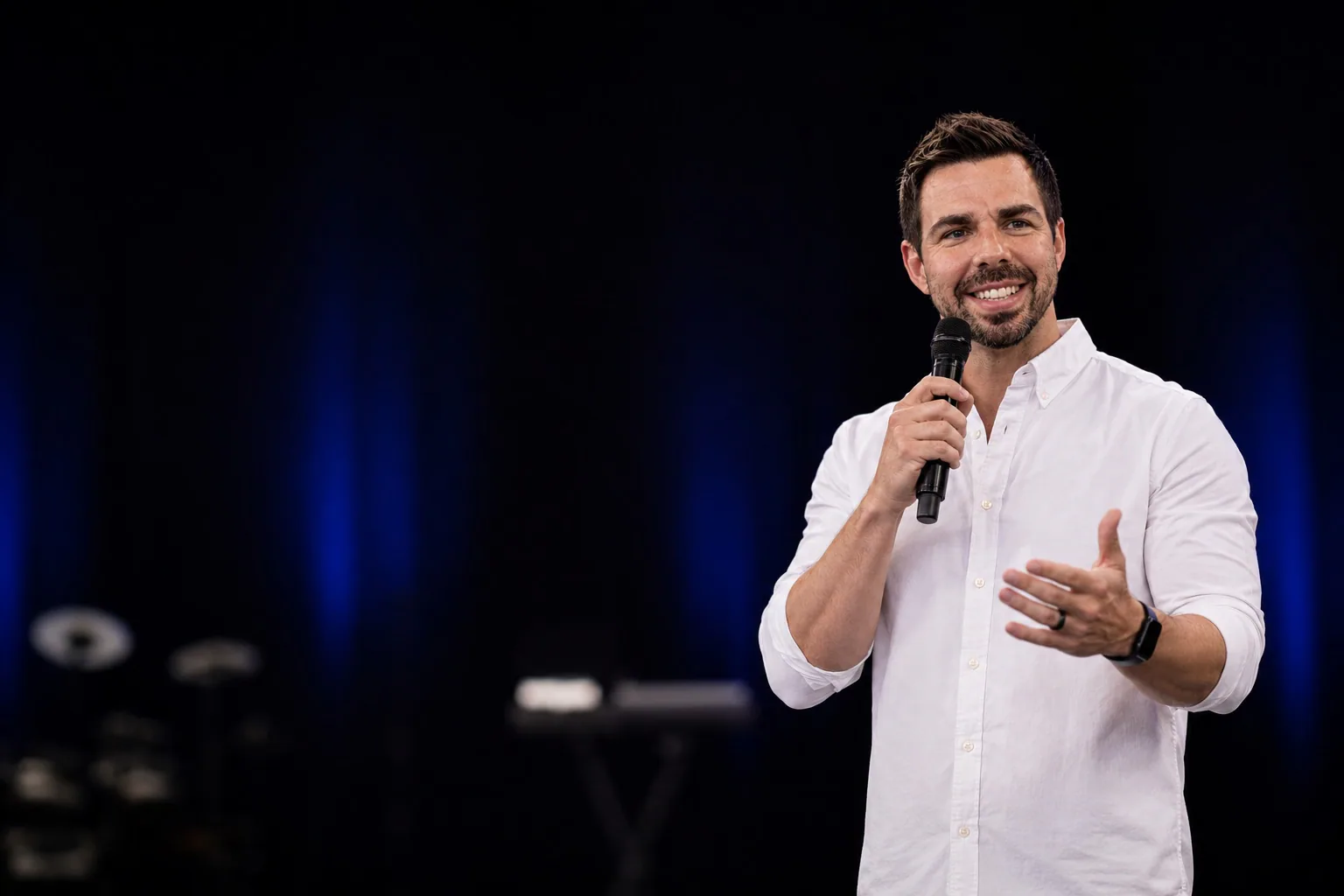
We love passionate poses.

At Rhythm, we use a singular graphic element: the rounded square. With its precise thickness and elegantly rounded corners both set at 15, it embodies our design ethos. Whenever there is an opportunity to incorporate a shape, we invariably turn to the rounded square, rendered in our timeless Rhythm color palette. This meticulous attention to detail is what defines our identity.
This final section brings all the elements together in real-world mockups and use cases. Think of it as our “show, don’t tell” section. This is a visual library that reinforces how we apply the brand consistently.